Spry Widgets
- Getting Started
- Site Management and Templates
- Hyperlinks
- Links and Anchors
- Cascading Style Sheets
- Publishing
- More Resources
- Tables and Divs
- Frame Layouts
- Image Maps
- User-Input Forms
- Spry Widgets
- Pop-Up Menus
- Behaviors
- Images
- Media Elements
- Rollovers
- Video & Multimedia
New to Adobe Dreamweaver CS3 is the ability to add "spry widgets" to pages. Spry is a framework for the Ajax language, built on Javascript that provides web designers with the ability to build richer, more interesting, and more interactive web pages. Adobe has worked hard to ensure that these widgets are both easy to use and accessibility-compliant, meaning that users who are not able to use a mouse or keyboard can still access and navigate your site using keyboard or voice commands.
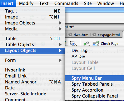
There are several Spry widgets built into Dreamweaver CS3, available from the Insert menu, under the submenu for Layout Objects.

Menu Bars
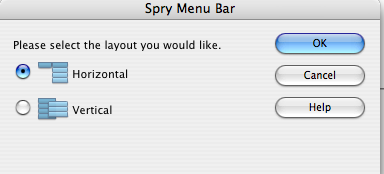
You can insert a Spry menu bar with pop-up functionality similar to the Java-based pop-up created in Fireworks. To insert this widget, simply choose it from the Insert -> Layout Objects submenu. After you choose whether you want a horizontal or vertical menu bar, you will get something that looks like this:

All of the programming already done for you, but you will need to use the popup toolbar that appears when you click the blue nametag of your widget. This is a straightforward Properties window where you select, from left to right, the menu item's name, its submenu list, and where each part of the list will go when clicked.

Alternatively, you can edit your widget if you go to the Code of your page (either choose code-only or split view) to change what the menus say and where they go when clicked. Luckily, editing this code is easy and straightforward. This is a good way to learn a little bit about HTML code if you are not familiar with it.
![]()
Initially, the code for the menu bar will look like this:
<ul type="disc" class="MenuBarHorizontal" id="MenuBar1">

      <li type="square"><a class="MenuBarItemSubmenu" href="#">Item
      1</a>

      <ul>

      <li><a href="#">Item 1.1</a></li>

      <li><a href="#">Item 1.2</a></li>

      <li><a href="#">Item 1.3</a></li>

      </ul>

      </li>

      <li><a href="#">Item 2</a></li>

      <li><a class="MenuBarItemSubmenu" href="#">Item
      3</a>

      <ul>

      <li><a class="MenuBarItemSubmenu" href="#">Item
      3.1</a>

      <ul>

      <li><a href="#">Item 3.1.1</a></li>

      <li><a href="#">Item 3.1.2</a></li>

      </ul>

      </li>

      <li><a href="#">Item 3.2</a></li>

      <li><a href="#">Item 3.3</a></li>

      </ul>

      </li>

      <li><a href="#">Item 4</a></li>

      </ul>
Edit the code simply by changing the # signs to URLs or pages you wish the menu to go to, and change the words "Item 3.1.1" and so forth to the things you want the menu to say. Each section of the menu bar is between <ul> tags, so for example, if I want to change the first part of the menu, I would look for:
<ul>

      <li><a href="#">Item 1.1</a></li>

      <li><a href="#">Item 1.2</a></li>

      <li><a href="#">Item 1.3</a></li>

      </ul>
And change it to:
<ul>

<li><a href="http://www.purduecal.edu">Purdue University
Calumet</a></li>

<li><a href="http://www.hecc.k12.in.us">HECC Conference</a></li>

<li><a href="index.html">Homepage</a></li>

</ul>
Then my widget will act accordingly, using the URLs and words I added. Notice that this is the code under Item 1 of the menu bar above.
Tabbed Panels, Accordions, and Collapsible Panels
All Spry widgets work under the same principles as the menu bar widget described above. Simply insert the widget of your choice, and edit the code to match what you would like to see. Tabbed Panels, Accordions, and Collapsible Panels are intended more for inserting content into a page in different ways and layouts, however, rather than for navigational purposes. Take a look at the examples and the code used in them.
Tabbed Panel
- About Tabbed Panels
- For More Info
The Widget's properties window:

My code:
<div id="TabbedPanels1" class="TabbedPanels">

      <ul class="TabbedPanelsTabGroup">

      <li class="TabbedPanelsTab" tabindex="0">About Tabbed
      Panels</li>

      <li class="TabbedPanelsTab" tabindex="0">For More Info</li>

      </ul>

      <div class="TabbedPanelsContentGroup">

      <div class="TabbedPanelsContent">Tabbed panels are great for
      sharing multiple bits of information in a single widget on a page. They can be
      used, for example, for help information, or directories.</div>

      <div class="TabbedPanelsContent">For more information on tabbed
      panels and their uses, try the Adobe help site at <a href="http://livedocs.adobe.com/en_US/Spry/1.4/index.html">http://livedocs.adobe.com/en_US/Spry/1.4/index.html</a></div>

      </div>
Accordion Example
The widget's Properties:

My Code:
<div id="Accordion1" class="Accordion" tabindex="0">

      <div class="AccordionPanel">

      <div class="AccordionPanelTab">News Item 1</div>

      <div class="AccordionPanelContent">You could put news of the
      day here</div>

      </div>

      <div class="AccordionPanel">

      <div class="AccordionPanelTab">News Item 2</div>

      <div class="AccordionPanelContent">You could put more news of
      the day here</div>

      </div>
Collapsible Panel Example
The widget's properties:

My Code:
<div id="CollapsiblePanel1" class="CollapsiblePanel">

      <div class="CollapsiblePanelTab" tabindex="0">Collapse
      Me!</div>

      <div class="CollapsiblePanelContent">Some content can go here</div>

      </div>
Just a small amount of code editing can go a long way in creating interesting menu bars and other elements for a page with Dreamweaver CS3. Try experimenting with Spry widgets, and don't forget that more can be downloaded and installed from the Adobe Exchange site at http://www.adobe.com/cfusion/exchange.
